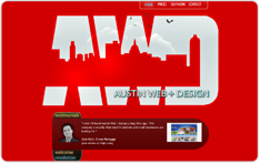
It’s been about a year since we opened our doors and launched the first version of austinwebanddesign.com. In that year, we learned a lot, our tastes became more sophisticated, and we built some very nice sites. And we became sort of jealous of how nice our clients’ sites were — nicer than our own in many cases. Ever hear of the carpenter whose house is falling down? Well, we’re not going to let that be us.
From the start, we decided to take our own advice for a change. That means choosing a great template and not messing it up with aggressive restyling. Here is the template:
Apart from the yellow and the slightly douchey photos, this will do nicely.
True, it’s not very risky, but hopefully, it’s timeless and reassures our customers that we produce professional, attractive sites rather than trendy art pieces (though we know which would be more fun!)
The next big thing for a site like ours is the portfolio page. We have no greater sales tool. We’d run across this awesome widget at one point and wanted it B–A–D bad. Unfortunately, this particular little jQuery widget is kind of a beast to implement. We got it working pretty quickly only to learn it does not mesh well with Pretty Photo (a jQuery lightbox-style viewer we enjoy). Fortunately, we found a forum that led us to a site where it was working nicely with FancyBox. Then we styled it to look like yet another portfolio page we’d seen, and amazingly, it worked! Lastly, we bought a slideshow tool so that when you clicked on any item, it would open a little presentation. Shew!
With that out of the way, we got creative with the three front–page images and slogans. With two UT Advertising majors on the case (Lily and Isaac), this was the most fun part thus far. Ah advertising — our first love.
Here are some other improvements we made to the template:
- Changed yellow to red
- Replaced menu with drop-down menu
- Added rotating testimonials
- Replaced home–page icons
- Made search box work
- Added contact form to bottom of every page
- Added fade–in fade–out effect for page transitions (doesn’t really work in IE for now)
- Expandable text panels and tooltips
Last but not least, content content content. Not only for you viewers. It’s especially important that this site ranks well in Google search results, and for that, you need lots of content. Fortunately, the drop–down menu from Dynamic Drive allows us to add lots of pages. Also, fortunately, we like to write.
We hope you enjoy viewing this new version of our site as much as we enjoyed making it.
